Lesson · 2nd, 3rd, & 4th Grade
Data and Graphs
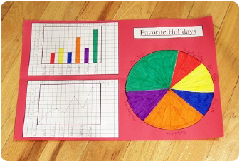
The purpose of this project is to teach students how to use the same data to make three different graphs: the bar graph, the line graph, and the circle graph.
The big idea
Begin by explaining the difference between data and graphs. Data is information, usually in number form. Graphs are a way of displaying that information so it is easier to understand. Use a completed project to show what each type does best: the bar graph is ideal for comparing differences in number or size, the line graph is ideal for showing change over time, and the circle graph is ideal for comparing parts of the data to the whole (you can readily see that about one-fourth of all students chose Halloween, for example). Most important, make sure students understand that all three graphs display the very same data.
Learning objectives
By the end of the lesson, students will be able to:
- Explain the difference between data and a graph.
- Build a bar graph, a line graph, and a circle graph from one data set.
- Say what each graph type shows best.
- Recognize that all three graphs display the same information.
Common Core alignment
- CCSS.MATH.CONTENT.2.MD.D.10
Draw a picture graph and a bar graph (with single-unit scale) to represent a data set with up to four categories. Solve simple put-together, take-apart, and compare problems using information presented in a bar graph.
Building a bar graph from a single data set, with up to four categories, matches the bar-graph work this standard introduces.
- CCSS.MATH.CONTENT.3.MD.B.3
Draw a scaled picture graph and a scaled bar graph to represent a data set with several categories. Solve one- and two-step "how many more" and "how many less" problems using information presented in scaled bar graphs.
Scaling the bar graph beyond a single-unit scale and answering 'how many more' questions extends the lesson to this grade-3 standard.
Materials
- Pencils (1 per student)
- Grid sheets, page 129 (2 per student)
- Circle graph sheets, page 130 (1 per student)
- Two grid-sheet overhead transparencies (for the teacher)
- Crayons or markers (1 box per student)
- Scissors, 12" × 18" construction paper, and glue sticks
- The completed project, prepared by the teacher before the lesson
The project
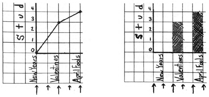
Work begins with the line and bar graphs. The most important difference between them, besides bars versus lines, is that only the line graph plots data at the intersections of the grid lines. Students must be careful where they write the holiday names along the horizontal axis: on the line graph, next to the big arrows; on the bar graph, next to the small arrows. Model this on overhead transparencies of both grids, along with numbering the vertical axes and adding each graph's title. Students color each bar of the bar graph a different color so the colors can match the circle graph later; the line graph needs no color.
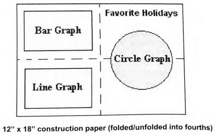
For the circle graph, explain that each segment represents a single student, so a holiday with three votes is colored in three segments, one with seven votes gets seven, and so on. Point out that, unlike the other two graphs, the circle graph will not show a holiday that received no votes. When all three graphs are complete, students cut them out (cutting the arrows off the line and bar graphs) and paste them onto construction paper folded into fourths, then label the circle graph by writing the holiday names directly on the paper.
Common student mistakes
- Labeling the line graph like the bar graph. Only the line graph plots at the grid intersections, so the names sit in different places on the two graphs. The big and small arrows mark which is which.
- Putting the no-vote category on the circle graph. A holiday with zero votes gets no segment, so it does not appear on the circle graph at all.
- Thinking the three graphs show different information. They display the exact same data. That is the central insight of the lesson.
Related lessons
Fractions
A circle graph is fractions of a whole, made visible.
Percents
Reading parts of a circle graph leads naturally into percents.
The 100 Number Chart
Another lesson about reading patterns out of organized numbers.
Multiples
Both lessons turn number relationships into something students can see.